The squatch V1.1. Design-Led, Rider-Backed, Strategy-Driven
-
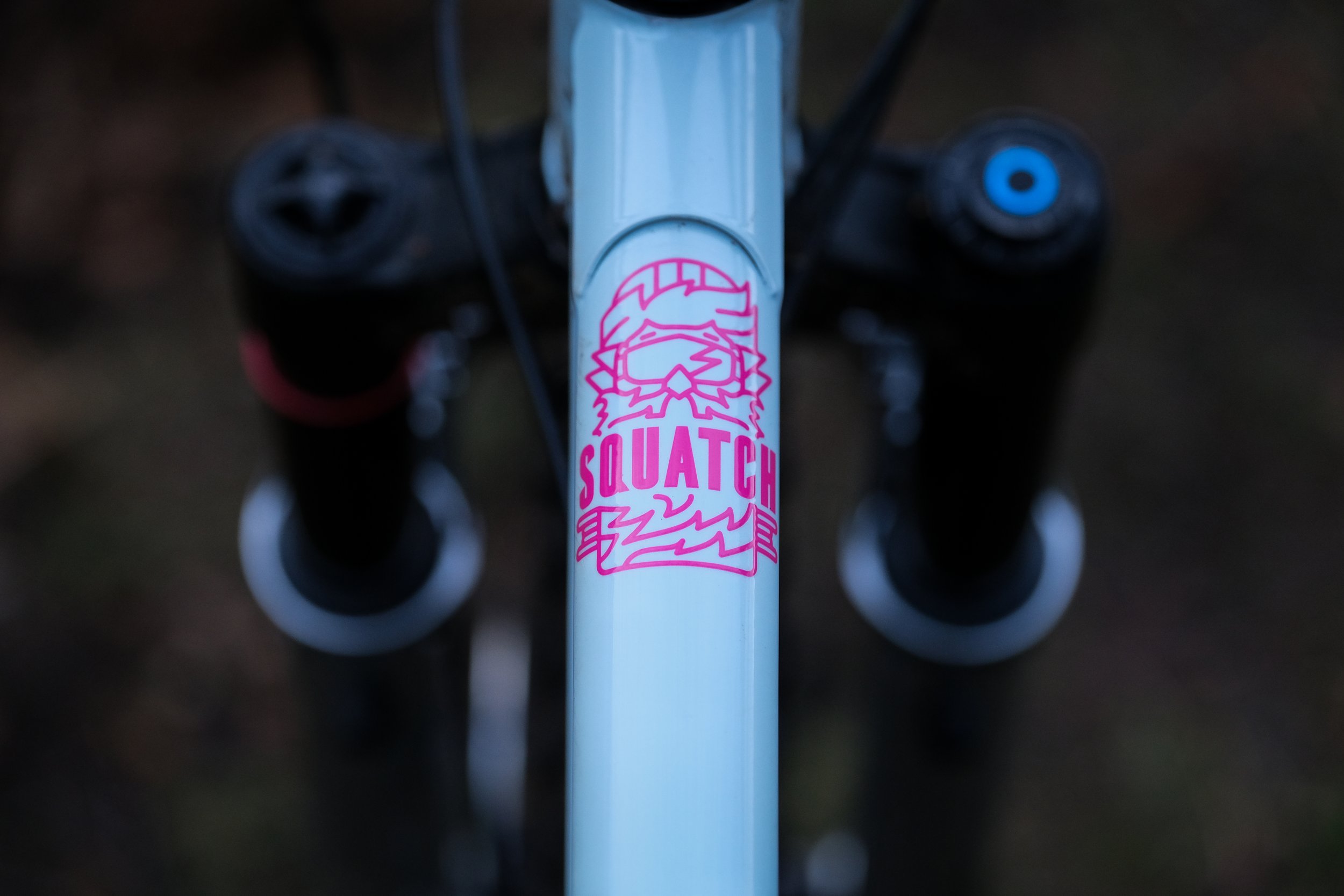
Colour with Character
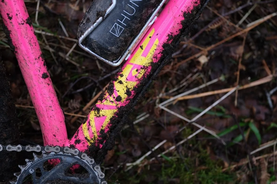
This wasn’t just a paint job, it was personality, precision, and months of research. I led the full colour development process for the Squatch V1.1, analysing industry trends, matching component tones (yes, even the exact yellow of Maxxis and Burgtec), and experimenting with combinations that captured the attitude of the bike. The final three colours, Fruit Salad, Glacier Mint, and Black Jack, were chosen not just to stand out, but to speak directly to the rider who wanted something rowdy, playful, and different.
-
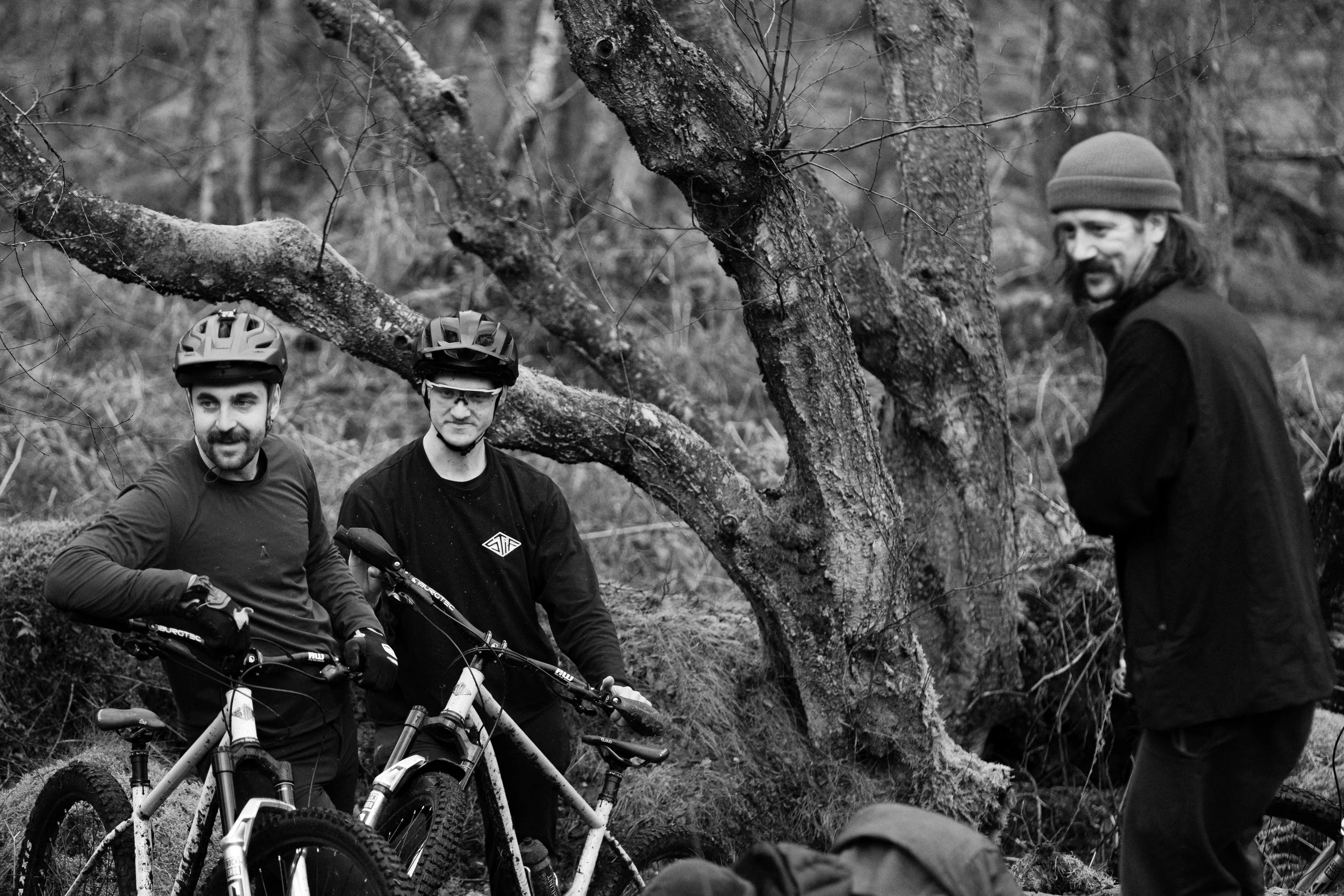
A Campaign That Hit.
Once the colours were dialled, I developed and delivered a full launch campaign to match the bike’s energy. I produced all the launch assets in-house, from photography and reels to a short film that acted as a sequel to the original V1 launch. I also managed press outreach, social content, and rollout strategy.
The goal? Make sure Squatch didn’t just show up, it showed off. And it worked. The campaign sparked conversation and drove hype.
-
Strategy Meets Stoke.
From the very first sketch to the last press send, I brought together strategic thinking and hands-on creative execution. This campaign used every tool in my belt, trend research, visual identity, film production, graphic design, copywriting, and paid media, to make sure the Squatch V1.1 had a presence as bold as the bike itself. It’s a project I’m incredibly proud of, not just because of how it looked, but because of how it made people feel.
Why this project matters?
STIF Squatch V1.1 is a bike I poured months of colour testing, trend research, and gut feeling into. From picking the perfect pink to tracking down the exact yellow that matched Maxxis and Burgtec, this was about more than just aesthetics. It was about translating the spirit of the bike into something people could see, feel, and get stoked on.
This project allowed me to bring together strategic trend research, hands-on product development, and full creative campaign support, from early concepts right through to launch content. I helped shape not just how the bike looked, but how it was seen.
The result? A rowdy, unapologetic steel hardtail that turned heads and sparked conversations. It’s proof that design and marketing should work hand-in-hand, and that colour really does matter.